On the Layout tab of the Web Site Editor, you are given the ability to design the basic elements of your Web site (headers, footers, navigation bar), Web site dimensions, and Web site alignment.
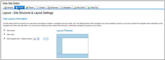
The Site Layout Information section makes it very easy for you to select whether you want a header or a footer on your Web site and to determine the position of your navigation bar (on the top or on the left).
-
To add a header or banner to your Web page, select the Site Header check box. You will upload the header later from the Upload Header File link. (If you don't want a header, clear the check box.)
-
To add a footer to your Web page, select the Site Footer check box. (If you don't want a footer, clear the check box.)
-
To add a navigation bar, select the Site Navigation Bar check box. (To remove the navigation bar, clear the check box.)
Note: In the Web Site Wizard (for new entities) or on the Content tab > Add Baseline Section button, on the Site Components page, you can select whether you want individual links to appear on the top navigation bar or on the left navigation bar. (You can have links in both places.)
Site Layout Information
The Layout Preview section shows how the format of your Web site will change based on the options you choose in the Site Layout section. For example, if you clear the Site Footer check box, the layout preview graphic will no longer have a footer.
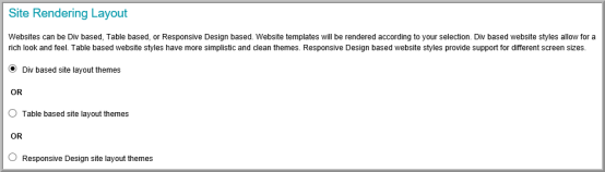
Site Rendering Layout
The Site Rendering Layout section enables you to specify whether or not your site's main HTML layout should be based on DIV elements, TABLE elements or Responsive Design elements.
Some Web Site designers prefer DIV Tag formatting for the ease of placing components inside blocks that are then controlled through style sheets without the need to modify the actual HTML whereas sites with many Lists may prefer table formatting instead where content is very fixed. Responsive Design formatting provides support for different screen sizes. Note that the DIV-based layouts and Responsive Design layouts also take advantage of the newest standards in Web development; HTML 5 and CSS 3. However, this also means that they are also only compatible with the newest Web browsers with regard to some functionality such as screen size support, rounded corners, and drop corners as a result. The older browsers should render your Site on the whole just fine however.
Setting DIV-Based, TABLE-Based, or Responsive Design Formatting
You may choose to use DIV-based formatting, table-based formatting, or responsive design formatting for your Web site.
Each type of formatting has its own advantages and disadvantages and supporting themes that will be selected in the next section of the Web Site Wizard. Some Web Site designers prefer DIV Tag formatting for the ease of placing components inside blocks that are then controlled through style sheets without the need to modify the actual HTML whereas sites with many Lists may prefer table formatting instead where content is very fixed. Responsive Design formatting provides support for different screen sizes.
The themes that are supported by each format type are not compatible with each other. When a format type is selected, only those themes available for that type of layout will be available in the pre-defined visual themes drop-down.
Note that the DIV-based and responsive design-based layouts also take advantage of the newest standards in Web development; HTML 5 and CSS 3. However, this also means that they are also only compatible with the newest Web browsers with regard to some functionality such as screen size support, rounded corners, and drop corners as a result. The older browsers should render your Site on the whole just fine however.
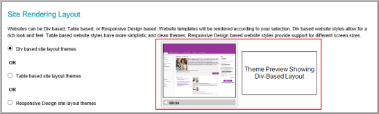
To select a DIV-based, table-based, or responsive design layout for your site:
-
Click the radio button for the option you prefer for your site.
- Selecting the DIV-based layout (instead of Table-based or Responsive Design) will build your site using DIV tags. The Theme Preview section (located in the Site Theme section of the Select Site Layout & Site Theme page) will update to show a preview of a page using a DIV-based layout.
-
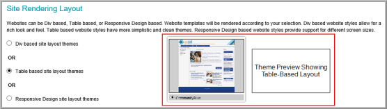
Selecting the Table-based layout (instead of Div-based or Responsive Design) will build your site using tables. The Theme Preview section (located in the Site Theme section of the Select Site Layout & Site Theme page) will update to show a preview of a page using a Table-based layout.
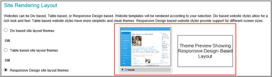
- Selecting the Responsive Design layout (instead of Div-based or Table-based) will build your site using responsive design elements. The Theme Preview section (located in the Site Theme section of the Select Site Layout & Site Theme page) will update to show a preview of a page using a Responsive Design-based layout.
After completing the settings for your header, footer, navigation bar, and site layout style you must specify what theme will be used on your site. This is done in the Site Theme section of the Select Site Layout & Site Theme page.
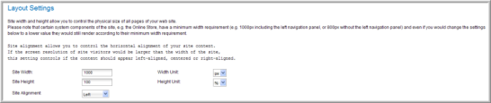
Layout Settings
The Layout Settings section allows you to define the height, width, and alignment of your site. You can specify the height and width by pixels or percentages.
Some Web pages, most notably the Online Store, have a minimum width requirement of 1000 pixels including the left navigation panel, or 800 pixels if you don't have a left navigation panel. The optimal settings for the Online Store are: