Form Standards
This page lists various recommendations for Form development.
Naming Convention
- In the Form Title, preface the name of the form with the client's abbreviation. If the form was generated by the Object Wizard then this should already be the case. If you add new forms, be sure to follow this naming convention.
- If the form was developed for eWeb then put (eweb) at the end of the name.
- If the form is used as the Profile Detail on a Profile Form, then give add - detail to the end of the form name.
General Considerations
The overarching goal is to have the disparate elements on a page look like part of a discernible and coherent geometric whole.
Form Types
- Basic add/edit forms; either full page or modal.
- With image in header section – see below
- Without image in header section – see below
- Profile screens – read only with edit buttons.
- With multiple edit buttons per profile page.
- With only one edit button per profile page.
- Wizards – forms used in wizard steps and sub steps. See Wizard Standards.
Text
As a rule, form labels and other text on a form should be in lowercase. Proper nouns are an exception to this rule.
Alignments
The following diagram illustrates some design guidelines:
General:
- Right align labels, terminate with colons
- Left align field values – leave 5 spaces between label and field
- Center-align labels to fields for edit and add screens.
- Top-align labels to fields for read only fields and profile forms.
- Form titles
- Are optional for basic edit and add screens
- If form title is left null, then the system will automatically add one based on the object’s name.
- If the form title is filled in, then the system will use that value for the form title.
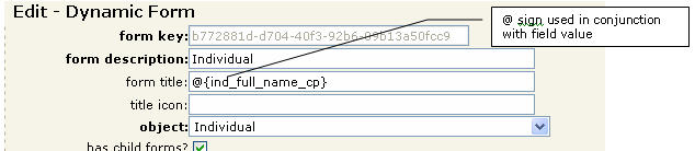
- If an @ sign is entered in the form title, then the system will not insert a title.
- If a field is Enclosed in {}, eg {ind_full_name_cp}, the value of that field for the record the user is on, will display on the form.
- You can combine the @ with {} to display only the value of the field. The individual profile is a good example of this method being used.
Example - Dynamic form, form title setup:
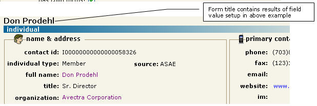
Example – profile with above form title setting:
Right Aligning Labels
If you'd like to right align labels, such as numeric fields, design the form and change the control class to DataFormCaptionTD. This CSS class right-aligns values. You should also right-align the controls on the Form Designer as well.
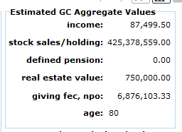
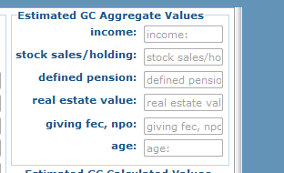
Here is a before and after version of a form and controls that started out with DataFormTextBox (since these controls are all textboxes) and was changed to DataFormCaptionTD:

Output with DataFormTextBox control class
|
Output with DataFormCaptionTD control class on all but the lowest field.
|
Design view of this form
|
Basic Add/Edit Forms
Section Headers
Use Section Headers to “chunk” information on a form/page. Organize information on a page into logical groupings or “chunks” divided by section headers. Section Headers should be treated as illustrated below all add/edit forms should use section headers.
General information:
- If an image is used, sizes specified on the form must correspond with actual size (you may need to “get properties” to establish size until a better method is devised). Images are not in vector format and will therefore not scale (gracefully).
- Top Section headers should be placed at the very top, left of the page and extend the length of the page.
- Section headers that are in the middle of bottom of the page, should be place at the left most of the page and extend the entire length of the page.
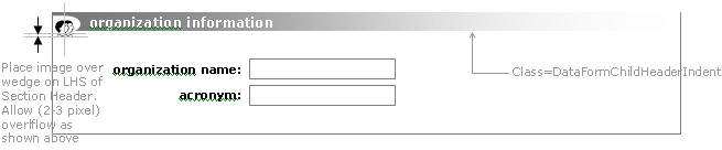
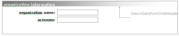
- If an image is used in the section header, use style sheet class = ‘DataFormChildHeaderIndent’.
- If an image is NOT used in the section header, use style sheet class = ‘DataFormChildHeader’.
- No edit images or links are used
Subsections
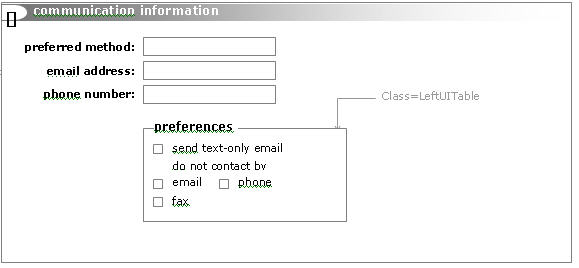
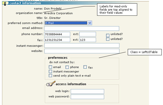
Subsections occur within a page when some items within a section have a child-parent relationship with an item in the section. An example is “communication options” or preferences under a “contact” or “communication” header.
General information:
- Subsection Container/Div – leave spaces to the left and right of data
- Control to add = DIV
- Control Class = DIV
- Control Style = Use style sheet class = ‘LeftUITable’
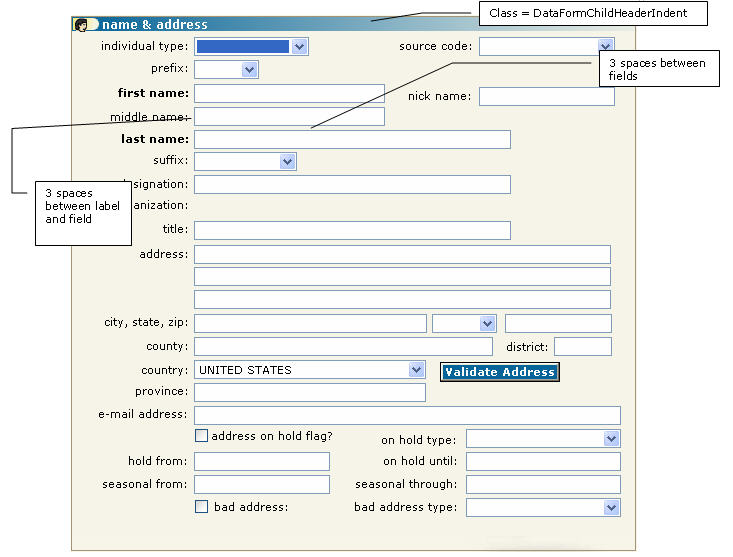
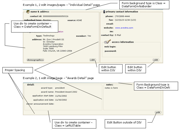
Example 1 – Basic ADD/EDIT screen WITH image in section header, ‘Individual Edit – Name & Address’ screen:
Example 2 – Basic ADD/EDIT screen with image in section header and using SUBSECTIONS, ‘Individual Edit – Contact Information’ screen:
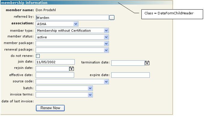
Example 3 – Basic ADD/EDIT screen WITHOUT image in section header, ‘Membership Individual’ screen:
Profile Pages
Profile Forms should have at least two sections; a left and a right one. If possible keep the sections symmetric, however this is not required if the data doesn’t dictate. Split the screen into two sections, especially if the form has descriptions or comments. For these cases, the left section should contain the majority of the detail, and the right section should contain the comments or description information.
Subsections occur within a page when some items within a section have a child-parent relationship with an item in the section. An example is “communication options” or preferences under a “contact” or “communication” header.
General information:
- Image sizes specified on the form must correspond with actual size (you may need to “get properties” to establish size until a better method is devised). Images are not in vector format and will therefore not scale (gracefully).
- Page title and subsection title, and their formats are handled through the framework. Do not add these in the designed form.
- If profile design requires something other then one of the two basic setups, speak to Enonche for design specifications.
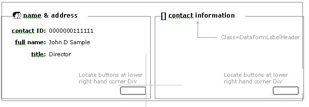
Two types of basic profile designs:
- Multi-section with separate edit pages on a single form – “Individual Detail” page, for example
- Background Style - Use style sheet class = ‘DataFormDivNoBorder’.
- Place an image in front of the label, if one is available. Images are optional.
- Section labels - place 5 spaces/pixels from the top of the screen
- Control to add = Label
- Control Class = Label
- Control Style = Use style sheet class = ‘DataFormLabelHeader’
- Section containers or Divs.
- Control to add = Sizable Box (DIV)
- Control Class = DIV
- Control Style = Use style sheet class = ‘DataFormDivDefault’
- Left Container/Div should be left justified (left edge of DIV extends all the way to the left of the screen).
- Right Container/Div should be right justified (right edge of DIV extends all the way to the right of the screen).
- Leave 10 spaces/pixels between the 2 containers/divs.
- Extend both Left and Right containers/Div to the bottom of the screen
- Place [edit] images in the bottom, right corner of each section’s container/Div.
- Section labels - place 5 spaces/pixels from the top of the screen
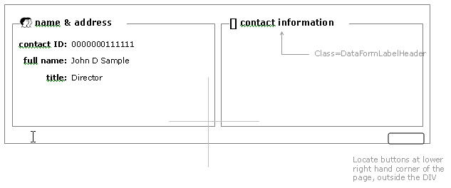
- Multi-section with only one edit page for the entire form – “Awards Detail” page, for example
- Background Style - Use style sheet class = ‘DataFormDivDefault’.
- Place an image in front of the label, if one is available. Images are optional.
- Section labels – place 5 spaces/pixels from the top of the screen.
- Control to add = Label
- Control Class = Label
- Control Style = Use style sheet class = ‘DataFormLabelHeader’
- Section containers or Divs.
- Control to add = Sizable Box (DIV)
- Control Class = DIV
- Control Style = Use style sheet class = ‘LeftUITable’
- Leave 10 spaces/pixels for left margin. Left edge of DIV extends 10 pixels away from the left edge of the screen).
- Leave 10 spaces/pixels for the right margin. Right edge of DIV extends 10 pixels from the right edge of the screen.
- The left margin and right margins should be equal.
- Leave 10 spaces/pixels between the 2 containers/divs.
- Leave 20 spaces/pixels for the bottom margin of the screen. Extend both Left and Right containers/Div to 20 spaces/pixels away from the bottom of the screen
- Place [edit] image in the bottom, right corner of the screen – outside of the containers/Divs.
Example of 2 edit buttons/pages for one profile, each edit button opens a different page - Locate buttons at lower right hand corner within each section/div.
Example of 1 edit button per page, all data on page is edited from same edit page/button. Locate button at lower right hand corner of the page
Here is the rendering of these examples:
Additional Guidelines
- Size the form width at 800 pixels. This is the ideal size for a form in netFORUM as it fits well. Even for a little page, you can still make it be 800.
- Set the Form's background style to DataFormDivDefault. This encloses your form in an attractive border.
- Before saving the form, press the Fix Caption Widths button to remove extra white spaces. This can be especially important for eWeb.
- Be sure to set the Tab Order. Forgetting this means users will have a very annoying experience on this form.
- Avoid having too many inputs on the same horizontal row as this can clutter the page, and you might have to keep the inputs so skinny that there will not be enough room to type. At the same time, don't simply stack each label on its own row as your page could grow too tall. Use good judgement. Look at attractive forms in netFORUM and try to model your form after this.
- If you have one form with many inputs, try to group them by topical area. Enclose a group of inputs with a Div and a Label to make this more approachable for a user. No one wants to look at one enormous form without any organization.
- If you have too many inputs for one form, then consider breaking these out into two or more smaller forms. This is especially useful for sites that have dozens of extender columns.
- Labels should have a colon at the end.
Right
name:
Wrong
name
- Label controls are bound to their input controls. If for some reason you accidentally delete a label, don't just add a label back -- remove the form control and then add the control and its label back to the form (avoid doing this on baseline forms, though, as this complicates upgrades). This is important because of conditional invisibility: if a contol is made invisible, then its lable must be invisible too.
- Don't let big columns (size > 200 or av_textdata type) remain as simple TextBoxes. Go to the Column definition and change the Control Class to "TextBoxMultiLine" or "RichTextBox" if you need HTML. Recommend "TextBoxMultiLine" in most cases. Don't just do this on the Form, do it on the Column definition so the default will be correct. Next, refresh session and add this back to the Form. Make the control bigger to give the user room to type and view.
- Size DropDownList lengths accordingly. It is annoying to not be able to see the entire code in the dropdownlist. Many times in initial development you will add short and simple codes (like A, B, and C) but in production the codes might be much longer. This goes back to good database design as your dropdownlist should be long enough to accomodate a long code based on the column width of the underlying code column.
Case Study
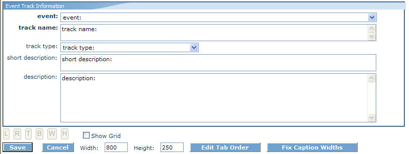
If you look at this image above you will see the following good practices:
- Width is 800 pixels
- Form's Background Style is DataFormDivDefault
- Header label (Event Track Information) using DataFormChildHeader control style
- Labels are properly right-aligned
- Inputs are properly left-aligned
- Track Type dropdownlist is wide.
- Input widths are mostly the same, avoiding a jagged effect on the right
- Minimal wasted space on the bottom
Here is one bad practice:
- The short description should be a TextBoxMultiLine!
Form Substitution
See Substitute Form for information about substitute forms.