
Chart Report Type Options
The following options are available for Chart Report types.
Chart Type Toggle
To toggle between a Column Chart and a Pie Chart, expand the Charts menu and drag and drop the desired chart type into the Report Columns section of the Dataset Designer. The Dataset Designer Report Columns refreshes with a preview of what the selected chart will look like.
Note: This is a preview of what the report will look like. To see the actual report click Run Report.
Captions and Color Palette
Enter a caption for the X axis in the X Axis/Category Caption field and for the Y axis in the Y Axis/Data Caption field.
Change the color palette for the chart by expanding the Color Palette drop-down menu and selecting a new color scheme.
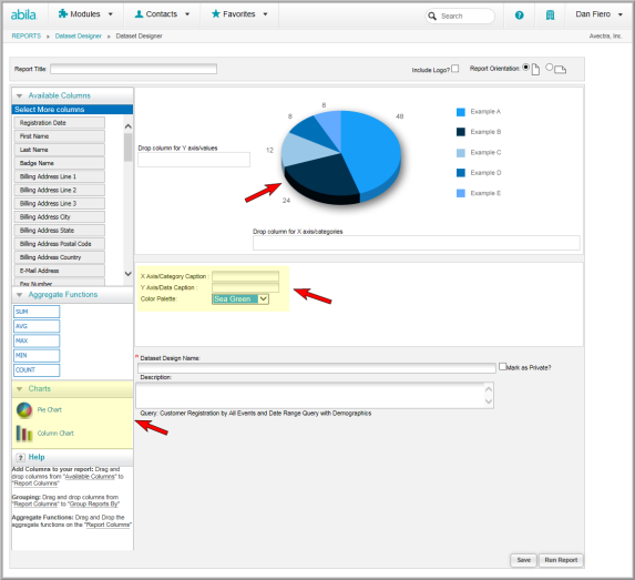
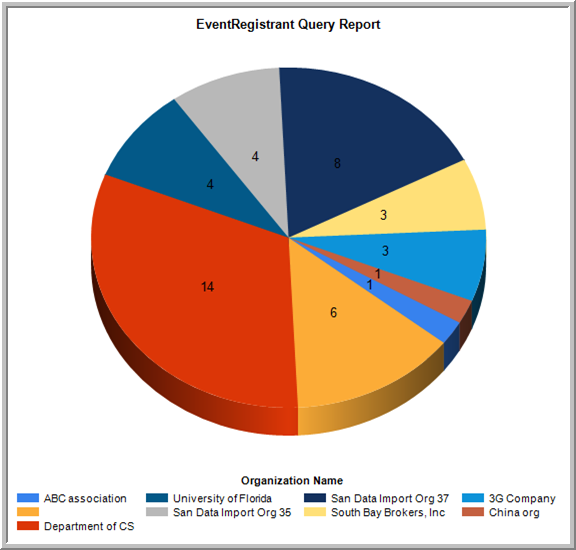
Chart Example
In this example, Organization Name is on the Y axis and Badge Name (of the registrants) is on the Y axis.
Every single Badge Name does not display on the Y axis of this chart. However, since everyone who registers for an event is required to submit a badge name, it is a great way to get a count of the number of registrants from each organization by dragging and dropping the Aggregate Function Count to the column for Y axis/values.
Next Step
See Additional Dataset Formatting Options to complete dataset formatting.
Click Save to save the dataset as described in Saving the Dataset.
Or click Run Report to run the query report as described in Running the Dataset Report.